Relocation of the esteemed Spanish publishing company, Grupo Anaya
Valentín Beato, 21
Offices/Corporate Headquarters
65.000 ft²
5 months
Madrid, Spain
In this project, we talk about relocating the headquarters of the esteemed Spanish publishing company, Grupo Anaya.
We’ll tell you the whole story behind this success case, from beginning to end, including all the details of the project and every aspect of the physical execution of the works.
It all started with BNP Paribas RE, entrusted with finding a space suited to the needs of the client. The location chosen was in the new building owned by Torre Rioja, at Calle Valentín Beato, 21, in Madrid, in the heart of the MADBIT district. The strategic decision was to occupy 6,000 sq. m on two floors of this remarkable BREEAM-certified office building, with the aim of accommodating roughly 500 employees from the entire staff.
The confidence instilled by BNP Paribas RE resulted in their technical team being selected by Grupo Anaya for both project development and project management. Collaborating with Carlos Manzano Arquitectos, they initiated a bidding process that ultimately led to FLULLE being awarded the contract as the general contractor, responsible for all facets of the project, including civil works, installations, finishes, and even the procurement of furniture.
The design...
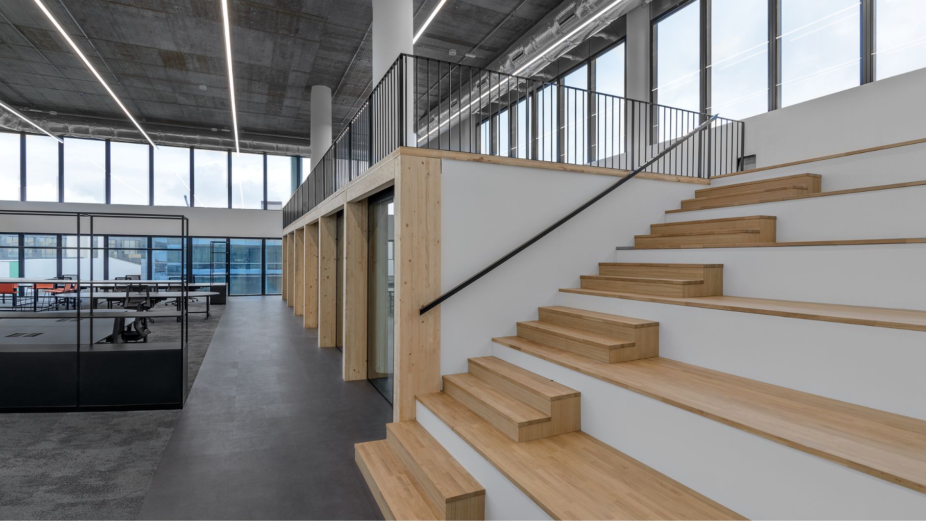
The design process employed to shape the new headquarters for Grupo Anaya in Spain can be likened to writing a book: it involved analyzing the distinct teams as characters, organizing the layout into work chapters equipped with structures to provide support, and incorporating common areas as narrative threads that connect all these elements.
The zoning adheres to a rational framework that considers the building’s constraints, encompassing factors like lighting levels, circulation and access points, structural grid, modulation, and the noise levels generated by employee activities.
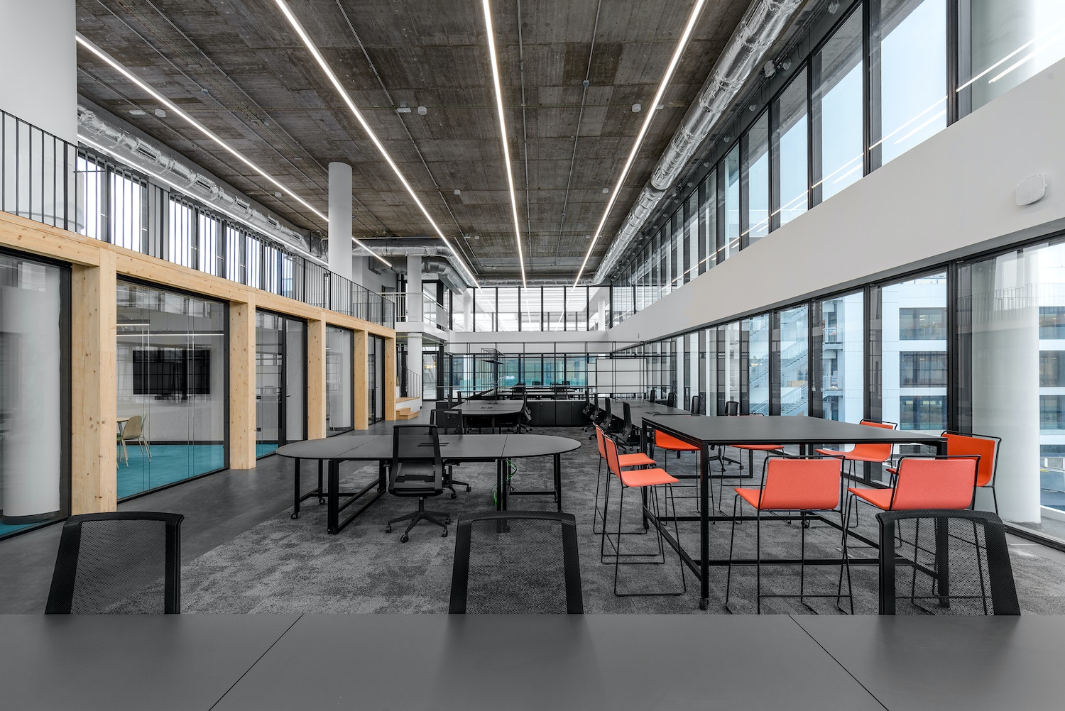
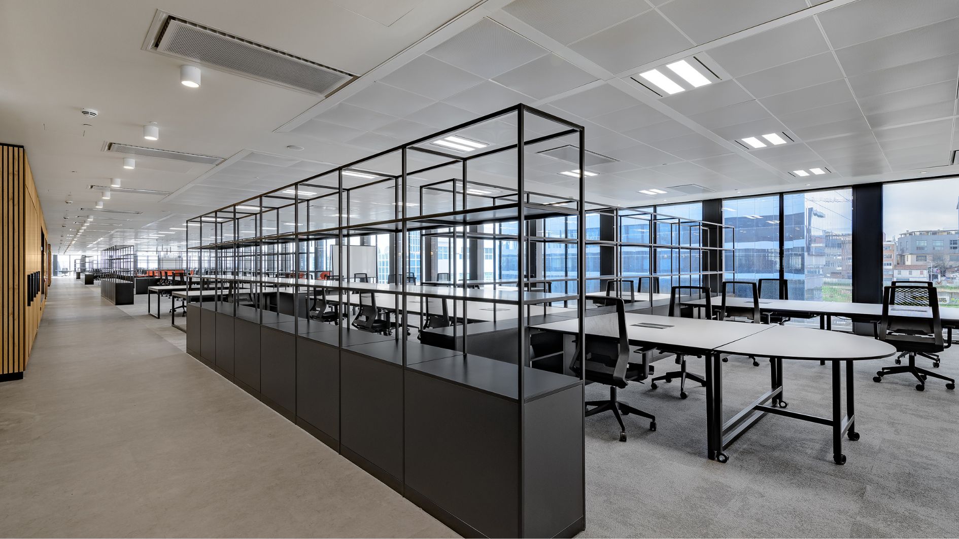
The office layout is primarily designed with permanent open workspaces positioned along the perimeter of the facade, complemented by closed spaces reserved for occasional use near interior courtyards. The former serve the needs of individual work and informal collaboration, while the latter house meeting rooms and support areas.
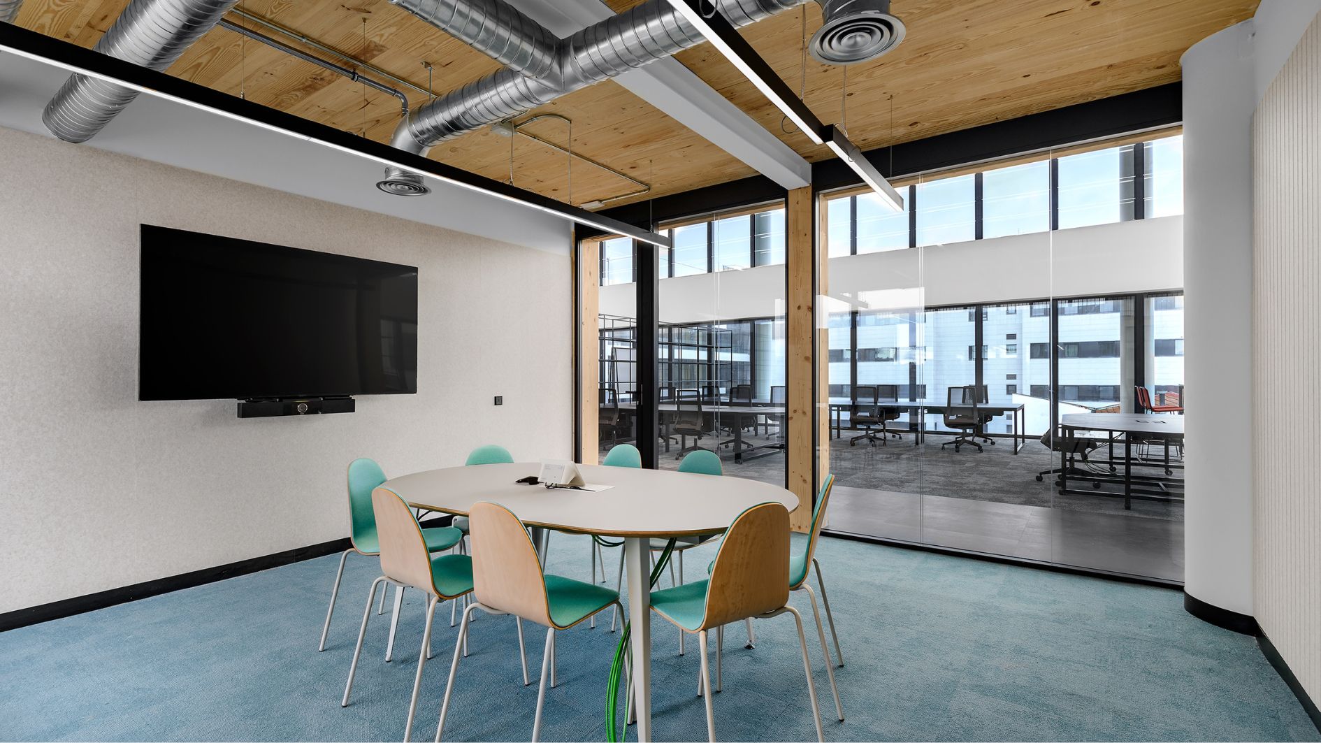
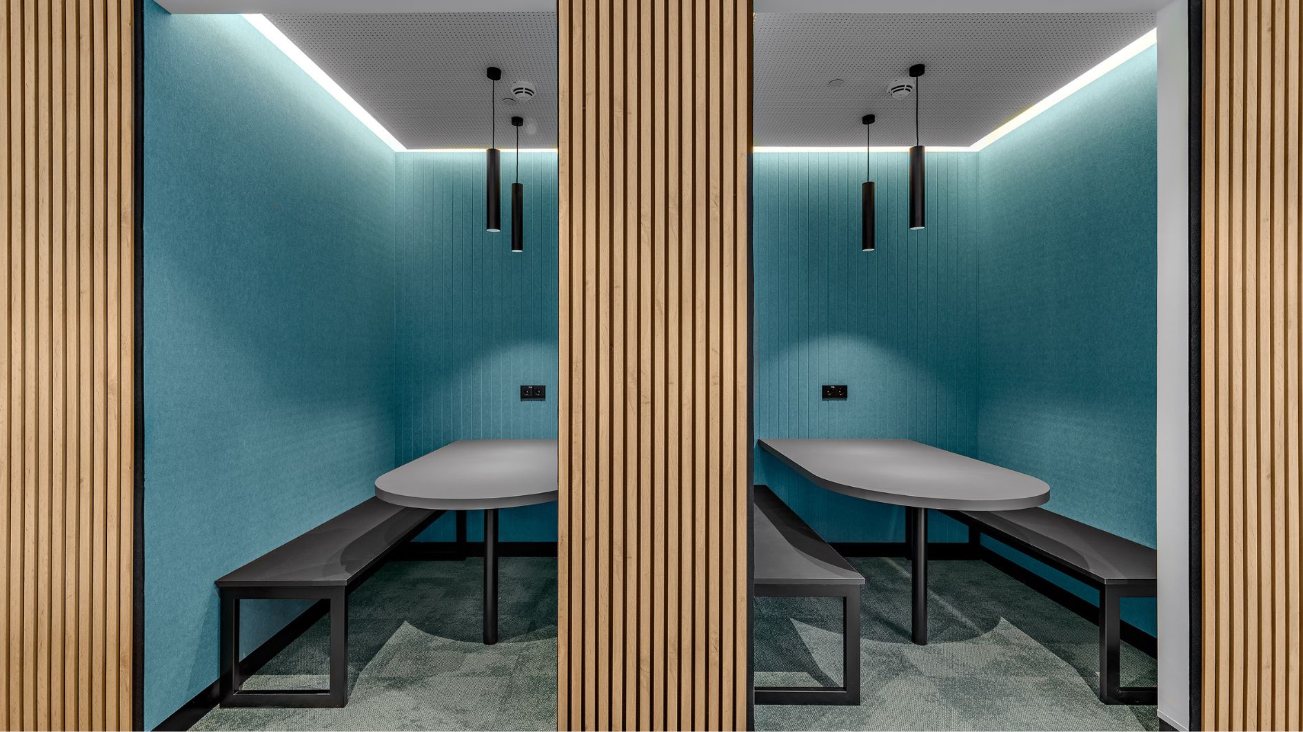
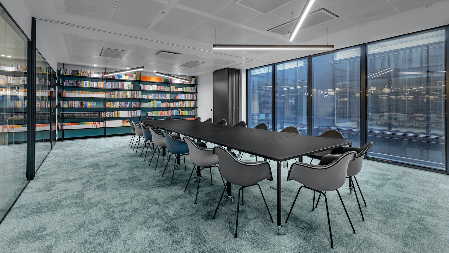
The open work areas are positioned alongside the facade, providing direct access to natural light and visual connections with the outdoors. This design enhances the well-being of employees assigned to more permanent workstations. The enclosed collaborative spaces, featuring meeting rooms of varying sizes, think-tanks for quick collaboration in small groups, phone booths for calls or online meetings, and more are situated adjacent to the interior courtyards. These spaces form distinct cores, resembling box-like structures.
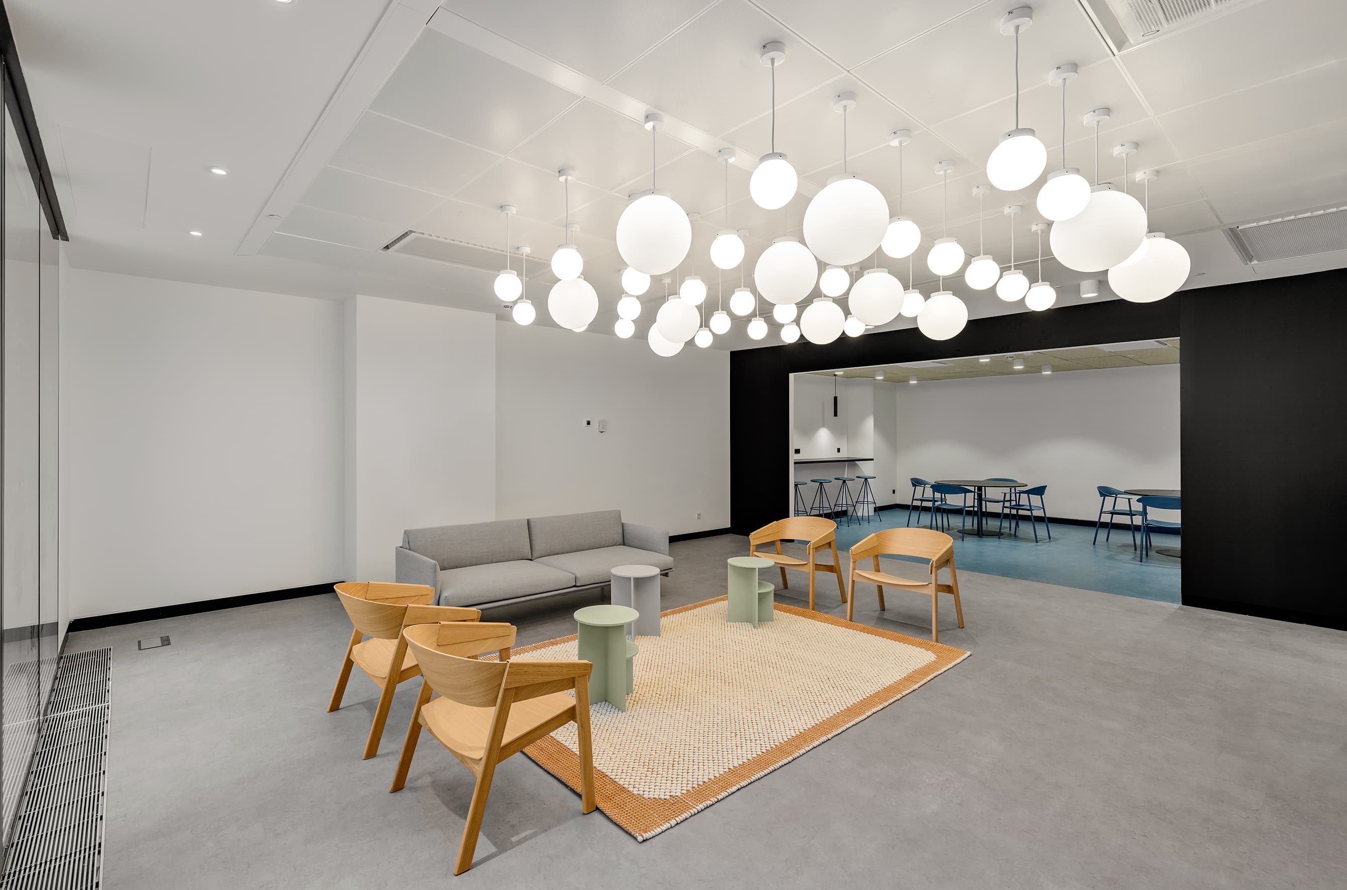
The interaction spaces, featuring a larger central meeting area on each floor and smaller zones around the coffee corners, are positioned near the main entrance and secondary vertical communication cores.
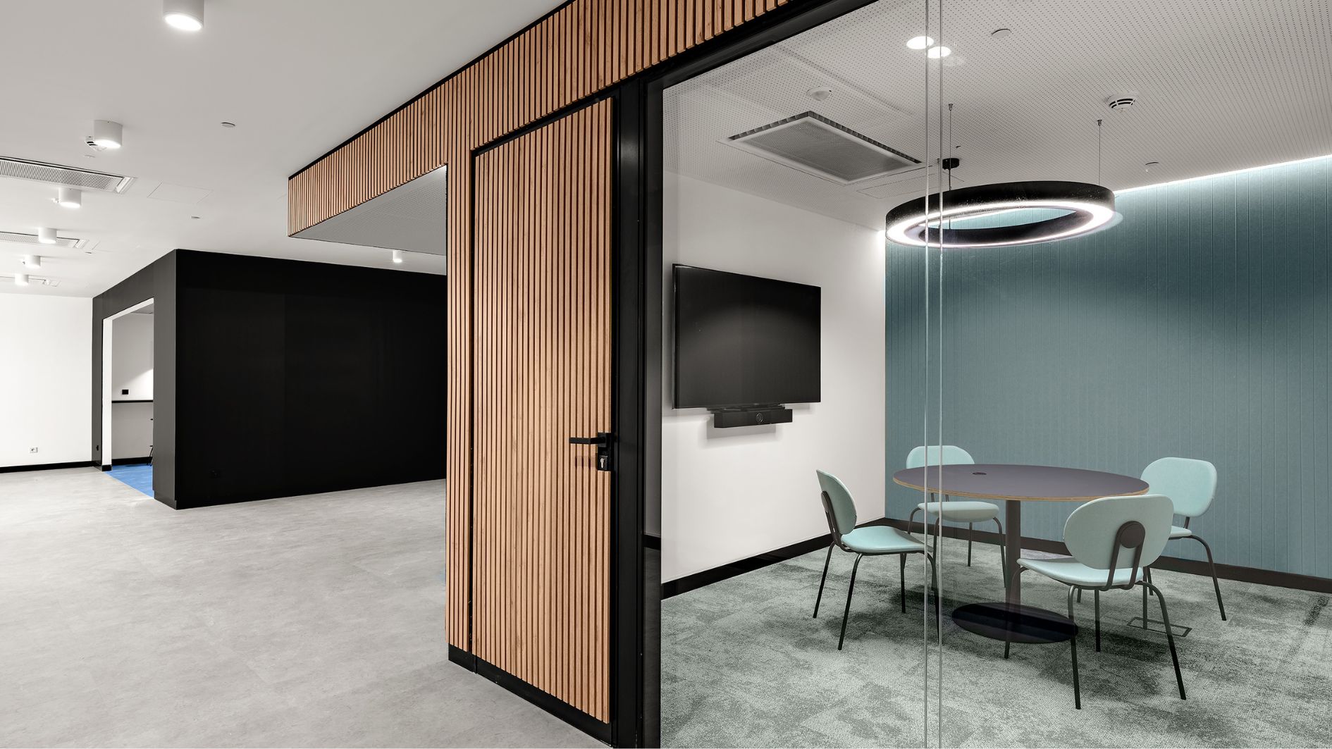
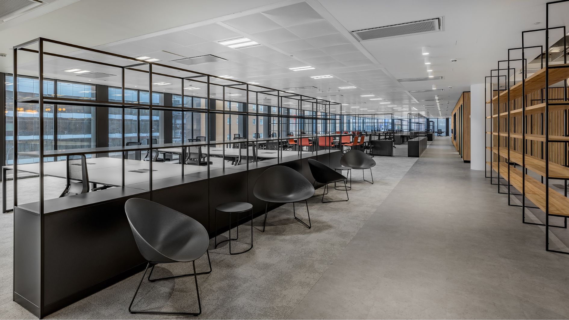
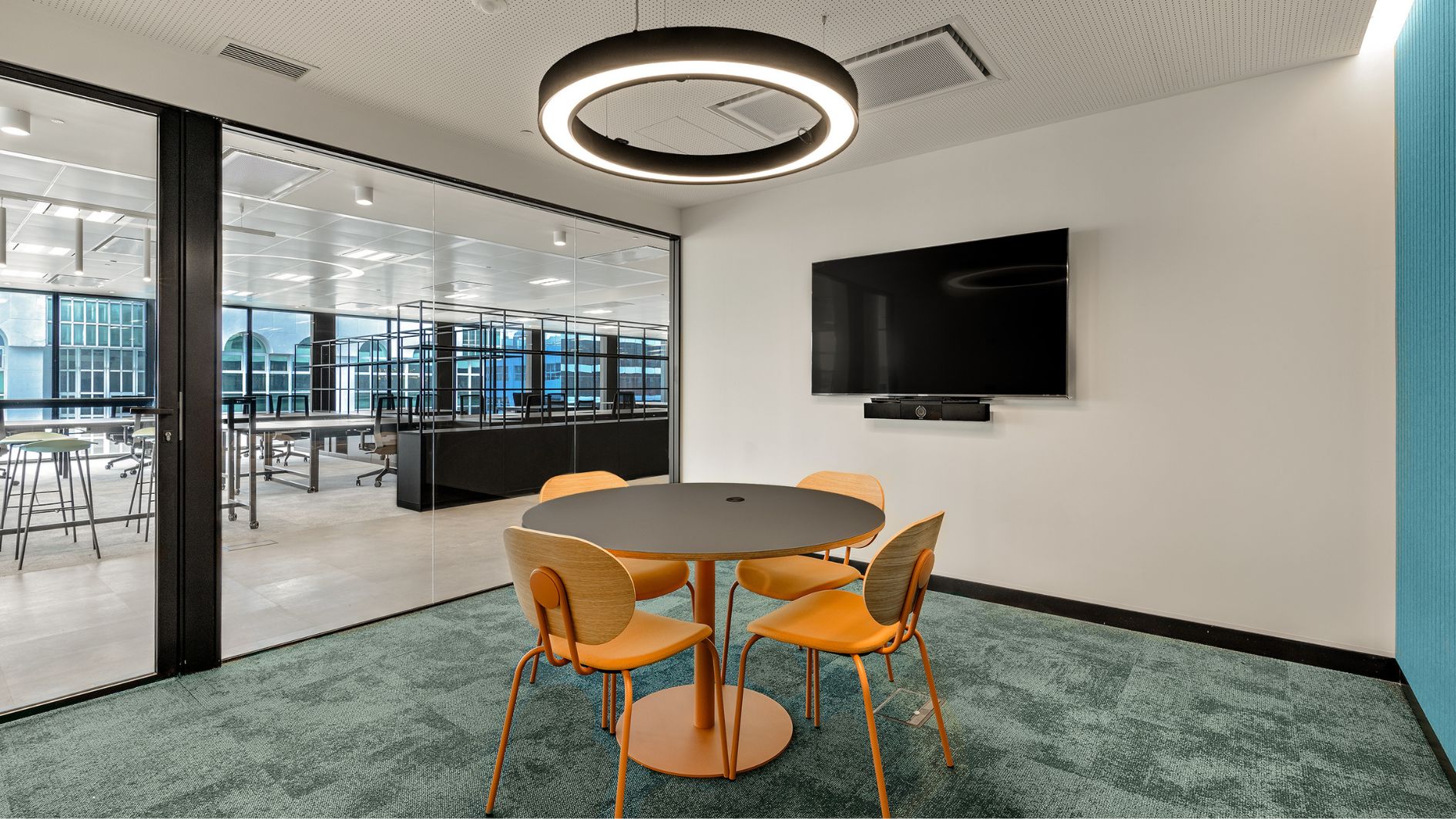
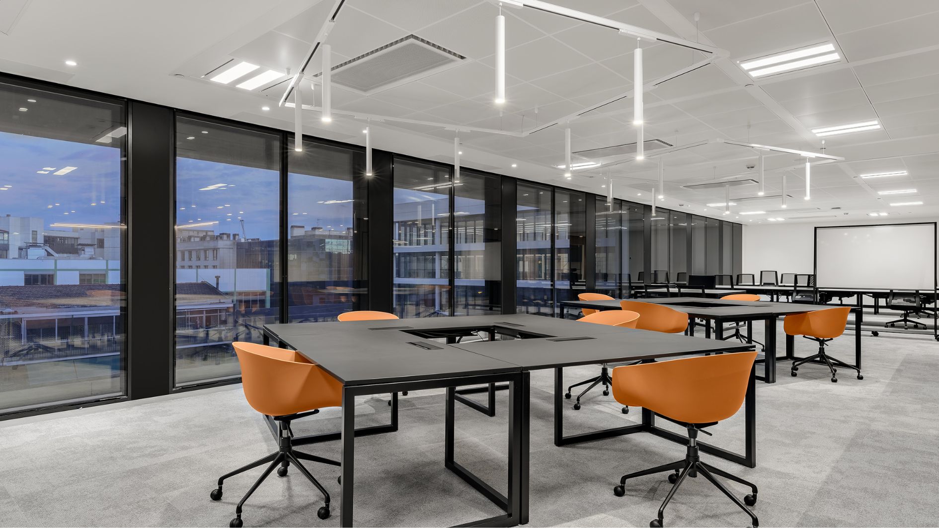
A key objective was to avoid the appearance of a uniform sea of workstations. This was achieved through the deliberate arrangement and rotation of tables, disrupting the conventional geometry of bench layouts and the building’s floor plan. The incorporation of shelves/filters and a limited number of high tables adjacent to workstations further fosters a collaborative environment, encouraging quick and spontaneous interactions. The custom-designed furniture, paired with a series of metal shelves, plays a pivotal role in organizing the space. Workstations, whether in bench configurations or individual setups for managers, are strategically placed. Additionally, three types of high tables have been designed to seamlessly integrate into the open area, facilitating impromptu meetings near the work zones.
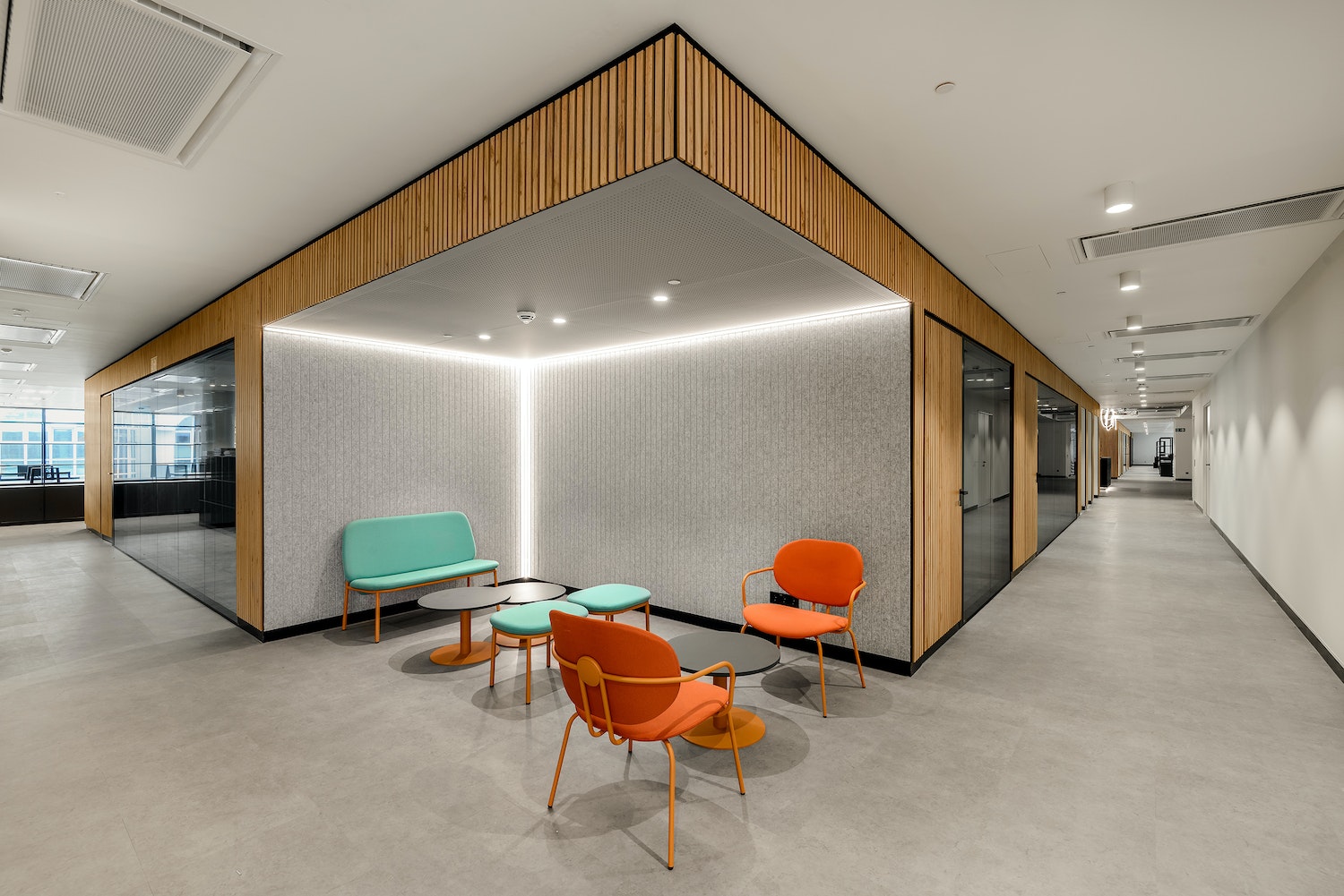
The project’s materiality draws inspiration from the inherent characteristics of the building itself, considering the finishes on both vertical and horizontal interior surfaces, as well as the curtain wall on the facade. Opting for a palette of neutral gray tones, accentuated by pops of color and infused with the warmth of wood and acoustically absorbent elements, the material choices serve as a tool to effectively zone and differentiate various areas within the office, preventing monotony. The meeting room cores are conceptualized as distinct boxes: those enveloped in wooden slats house larger meeting spaces, while those adorned with black paneling feature smaller meeting areas and coffee corners. Inside these enclosed collaborative zones, a soothing palette of blue-green tones is employed, while vibrant orange hues are strategically utilized in the open informal collaborative spaces. This thoughtful color scheme enables quick identification of informal points, creating a visually dynamic environment within the expansive open work areas.
The Implementation
In terms of implementing this space, several notable challenges arose. The building was still in its final phase of construction, presenting complexities in managing and organizing the execution of the project. Our work commenced in early August and concluded at the end of December 2022, ensuring a timely completion for the client’s crucial move in early January 2023. We came through.
We continue sharing more success stories like this one. Proud to have contributed to Grupo Anaya’s acquisition of a fantastic space for their day-to-day operations, providing a platform to pursue and achieve their corporate objectives.
Always #flexibletotheextreme
The Challenge
Services provided
- Fit-out
- Electrical Installations
- Mechanical Installations
- FP Installations
- Telecoms Installations
- Special Installations
- Security Installations
- Facility Services


